ROLE
Website designer and front-end assemble.
This platform is a sub-product of main services that the company provides.
The target audience for this product is different from the main audience of the other services provided by the company, therefore, the branding should be a bit different from the main branding of the company.
Challenges:
The website must look different from the main website but keep a similar visual style.
The focus of the website should emphasize community orientation rather than a commercial approach.

Process:
Defining the target audience
If you take a look at the main clients of the company, you will find that they are banking ecosystem insurance companies and many other big financial structures. This platform is oriented for programmers, developers and IT persons.
Therefore the approach is to use less marketing terminology and use a more visual language approach.

Getting away from the brand and still keep it
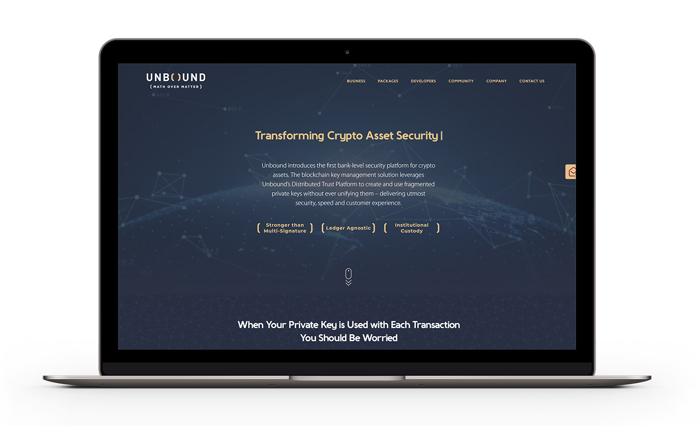
The brand main colours are purple, gold, white, and dark blue, combined with illustrated symbols from the science world.

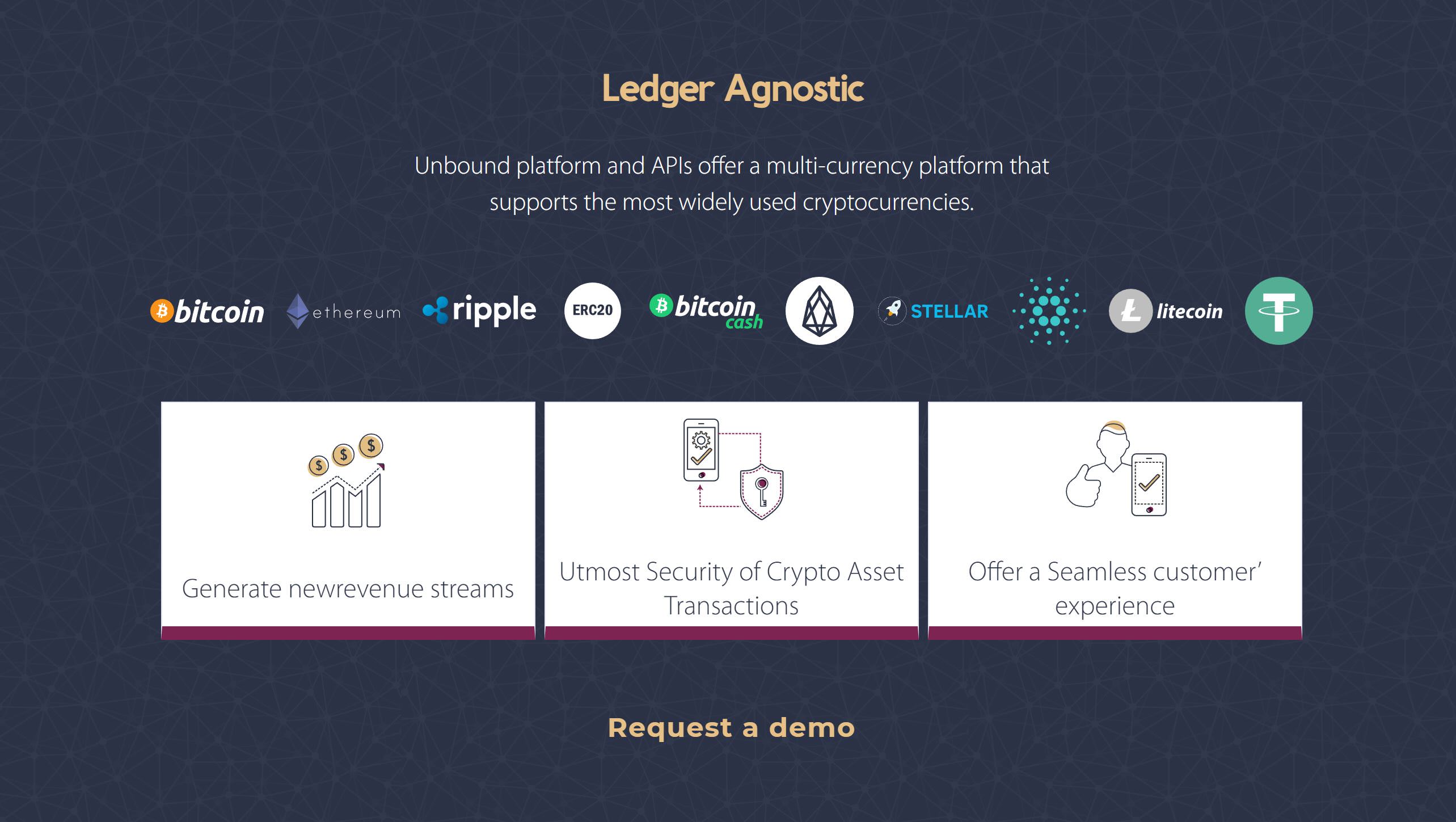
The change of the levels of white and dark blue as the background colours were used for achieving a strong visual change.

The rest of the colours more or less remained the same and instead of the scientific illustrations, mesh and network visuals were used.

Background videos and animations were added on the new website in order to add some interesting visual effects.

Link to website: https://www.unboundtech.com