ROLE
UX | UI designer and front-end assembly
Starting point
The old website of this NGO was built in 2009 The website suffered from bad usability, and the layout was unclear.
My challenge was to simplify the different types of visual content they had on the website make it mobile friendly and multilingual.

Problems to solve
Bring user traffic from the YouTube channel to the website and back.
Simplify the different data types and content types from the old website.
Create clear hierarchy between titles, descriptions, content and other the visual elements.
Simplify the menus and the navigation on the website.
Make responsive layout
Convert LRT to RTL layout.
Process
A list was made of the confusing parts on the website.
It was clear that the user would have problems with categorization and tags.
They looked the same, so basically, users never understood what the difference is between the two. This led to navigation problems on the website.
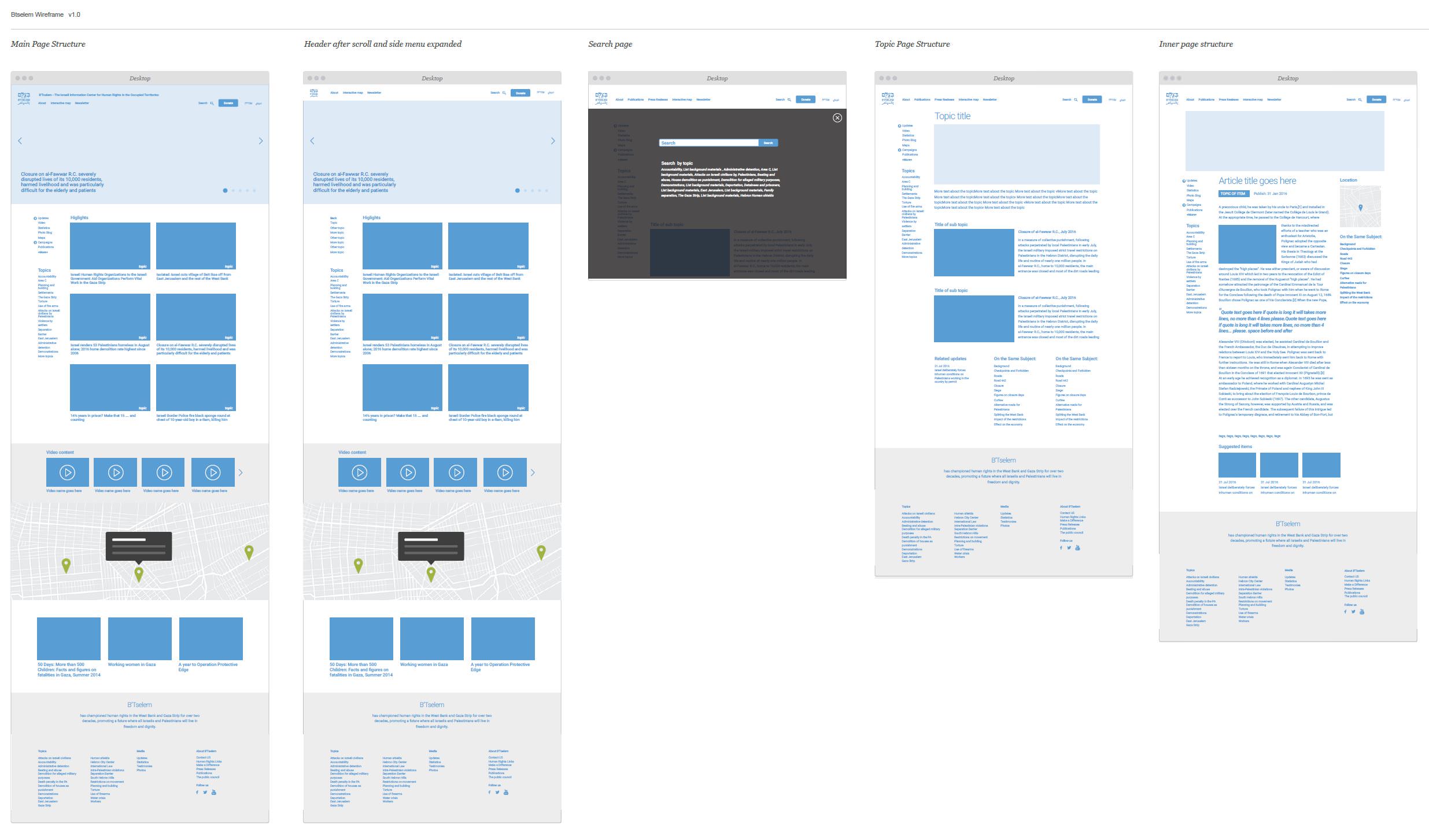
I started to create clear and strong wireframes


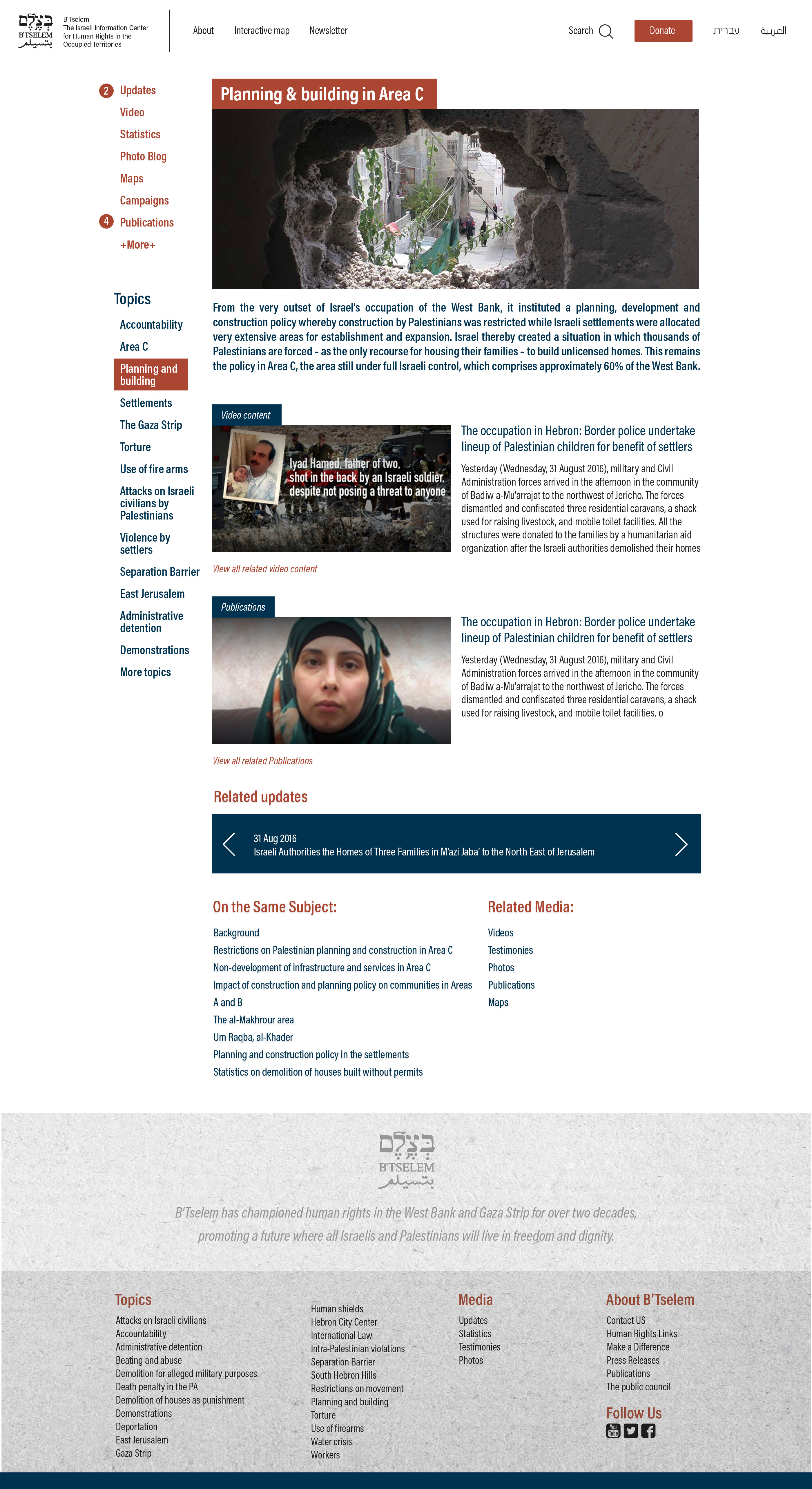
Clear visual differences were made by using two different colours and placing them in the correct informational hierarchy.

Handling with data

Link to website https://www.btselem.org/